Planting the Seeds of a Sustainable New Brand
- Post-merger branding is always difficult, but with the help of PMI best practices, you can cultivate a win-win brand solution
- Hiring neutral 3rd party consultants to conduct brand research and provide data-driven suggestions helps mitigate ego and emotion
- The relative strength of both legacy brands must be considered along with possible combinations and novel elements
- Collaboration and transparency are critical to determining the ultimate go-forward brand and helping to ensure widespread buy-in
- While design is important, the brand must also embody the combined organization’s shared values in order to grow and thrive
- Rebranding is never easy, and sometimes appears self-evident, but getting it right can be critical to achieving the shared strategic vision
Cross-Pollination
In any acquisition, a key consideration is post-closing branding. Will the buyer take a “to the victor go the spoils” approach, or will there be a new brand created that reflects both legacy companies? Whatever the outcome, it is critical to be transparent with the process and execute the rebranding as soon as possible after the transaction closes. The process of branding/rebranding needs to mitigate egos, emotions, and pride of ownership. Bringing in a neutral third party to survey the market, assess relative strengths in a dispassionate way, and facilitate branding discussions can help ensure a good outcome. This is especially true when two strong brands come together, as was true with Deep Water Point and Wolf Den. As thought leaders and seasoned practitioners in federal M&A and post-merger integration (PMI), we know the importance of succeeding in this area, and that the process we followed to create our new brand is a case study in PMI best practices.
Grafting Rootstock
While at first glance our new brand may seem fairly obvious, it represents the result of a thorough, data-backed process that involved hiring a third-party consultant to “test the soil” and conduct primary research into relative brand strengths. Going into our branding strategy, we thought we would sow the seeds to create a completely new brand that represented the best of our legacy organizations. However, cultivating seeds requires you to remain flexible and adaptable and research showed that the strengths of the two brands warranted refreshing one legacy brand as opposed to discarding the brand equity of both legacy organizations. Based on overwhelmingly positive feedback from customers and federal government executives, it was clear that the right decision was to graft a refreshed brand onto the strength of the legacy rootstock. In this way, we preserve the strength of our reputation and brand awareness, while repositioning the new brand for the broader scope of our combined capabilities.

Roots Run Deep
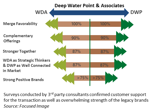
Our third-party consultant ran the numbers and found that 100% of those surveyed indicated our merger was favorable. Furthermore, 90% believed that the two companies’ offerings were complementary (not overlapping) and 87% thought the companies were stronger together. Additional data showed >75% of respondents agreed both companies held strong positive brands. Based on this data, we embarked on a collaborative effort to incorporate legacy roots into the design of our new logo. Existing brand elements such as the wolf paw print and the lighthouse were considered, but ultimately proved too inflexible. We also considered both legacy fonts as well as a host of new ideas in an effort to modernize two logos that had not changed in two decades. Finally, we considered the entire spectrum of color combinations in order to visually merge the two legacy brands while also standing out from a garden of red, white, blue, black, and gray consulting logos.
Bud Break
The choice of teal and orange pay homage to Wolf Den’s teal presentation templates and Deep Water Point’s pervasive use of orange. The ultimate font choice is deliberately modern, fresh, without serifs, and reinforces our emphasis on future growth. Our final logo was designed to reflect a double meaning. The image displays a diamond eye with an arrow and embedded chevron. This is meant to convey that our companies are greater together and displays our shared passion for helping organizations move forward in the federal market, with the benefit of our strategic vision. Lastly, incorporating “Associates” is a nod to the legacy Wolf Den spirit of collegiality and the “best idea wins” ethos while the use of the ampersand foreshadows future acquisitions and the intent to incorporate them under our broad brand appeal to yield bountiful results for all customers. Growing doesn’t mean you abandon your roots, and our combined DWP&A remains dedicated to our core values, mission, and passion towards our work and our clients.
Branding Considerations That Did Not Grow Roots
- Keeping a legacy brand of Deep Water Point or Wolf Den Associates
- Creating a new name with subtle legacy references such as Alpha Point or Orca (the “Wolf of the Sea”)
- Trying to blend legacy names with ideas like Wolf Water, Den Water, Deep Water Wolf, and Wolf Point
- Combining legacy logos, such as having a lighthouse with a wolf paw in the beacon or a wolf on the rocks of a lighthouse
- Incorporating the colors purple and green, which is more likely to invoke the Green Goblin than either company
- Using legacy fonts in the branding, logo, and templates
- Selecting a one-word moniker (e.g. Apple, Casper) that seems casual, incidental, and unrelated to the company and its work
- Developing a new portmanteau, such as Growthtum or Alightage, based on phonetics and obscure aspirational imagery
Kim Pack
571-318-0328
Kim.Pack@dwpassociates.com
Howard Seeger
443-517-7820
Howard.Seeger@dwpassociates.com
Jessica Butturff
703-786-1841
Jessica.Butturff@dwpassociates.com


